Graph comparing population of the United States and the United Kingdom
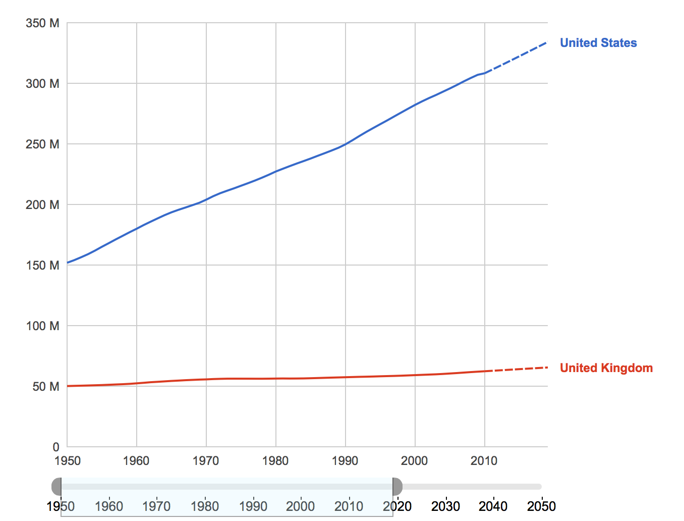
This is by the International Data Base (IDB), Demographic Statistics and the U.S. Census Bureau. For this graph, I looked at the population and explored the increase and difference of our populations. We have a lot more people than them and we have experienced a spike in population from 1950 to 2010.
